By Roger Keil
In this blog entry it is my pleasure to present some current work by Rob Fiedler, PhD student in Geography at York University and member of the City Institute at York University. Rob pulled together newly released 2011 census data for the Toronto CMA and produced two stunning maps that show the rate and density of growth in the Toronto area.
Fiedler explains the maps this way: “Map 1 shows population growth as height with the each CT symbolized according to % change between 2006 and 2011 (blue signifies population loss [-10% or more, -10 to 0%], tan signifies stable or low growth [0 to 10%] and red signifies growth [10 to 50%, 50% or more]). This image over-emphasizes growth on the periphery where the census tracts are geographically large (the big block in the West is Milton ... it looks so much larger because it is a greenfield area and all the growth is in one CT, whereas the condo boom downtown is spread across several geographically small CTs).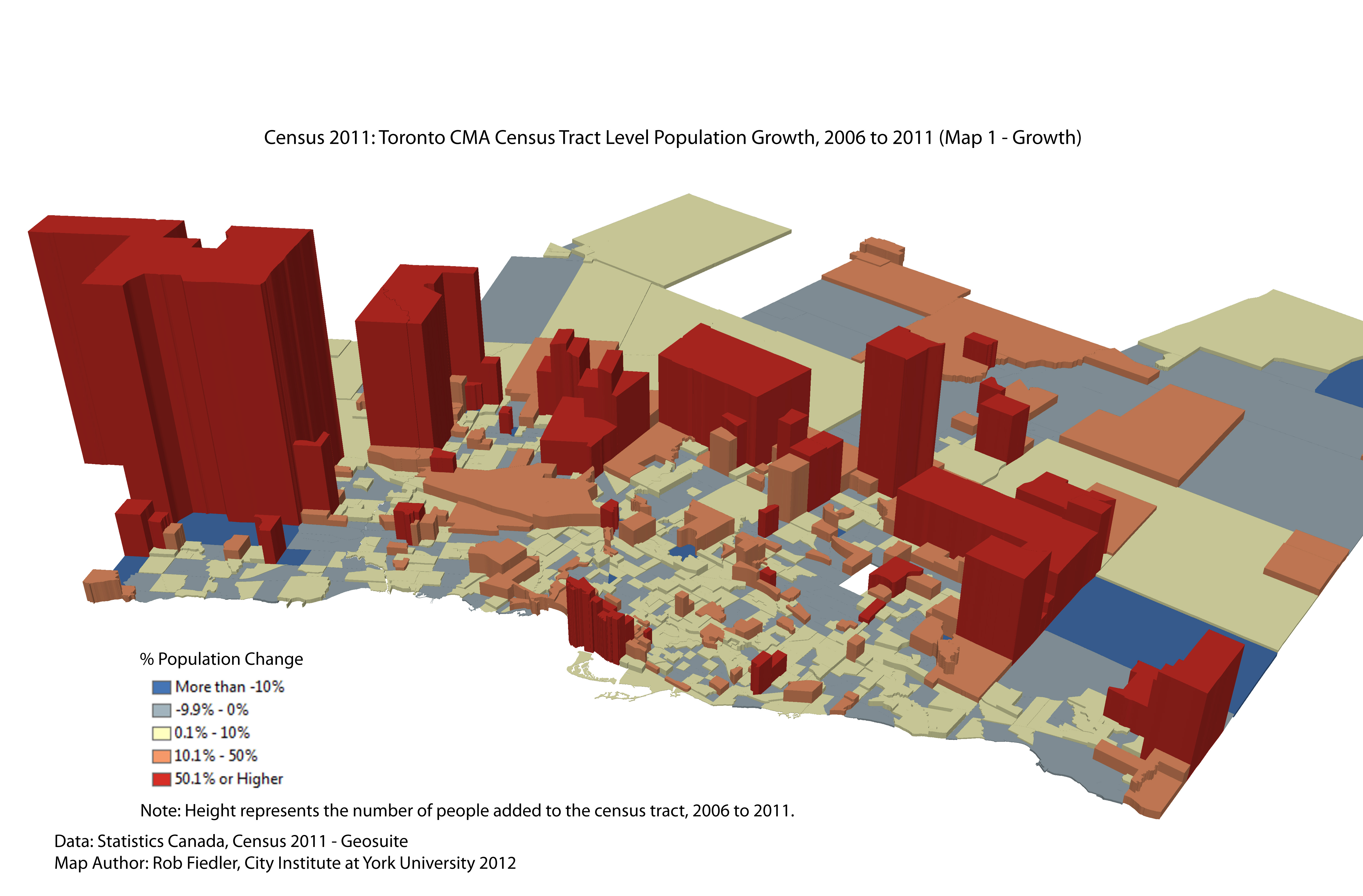
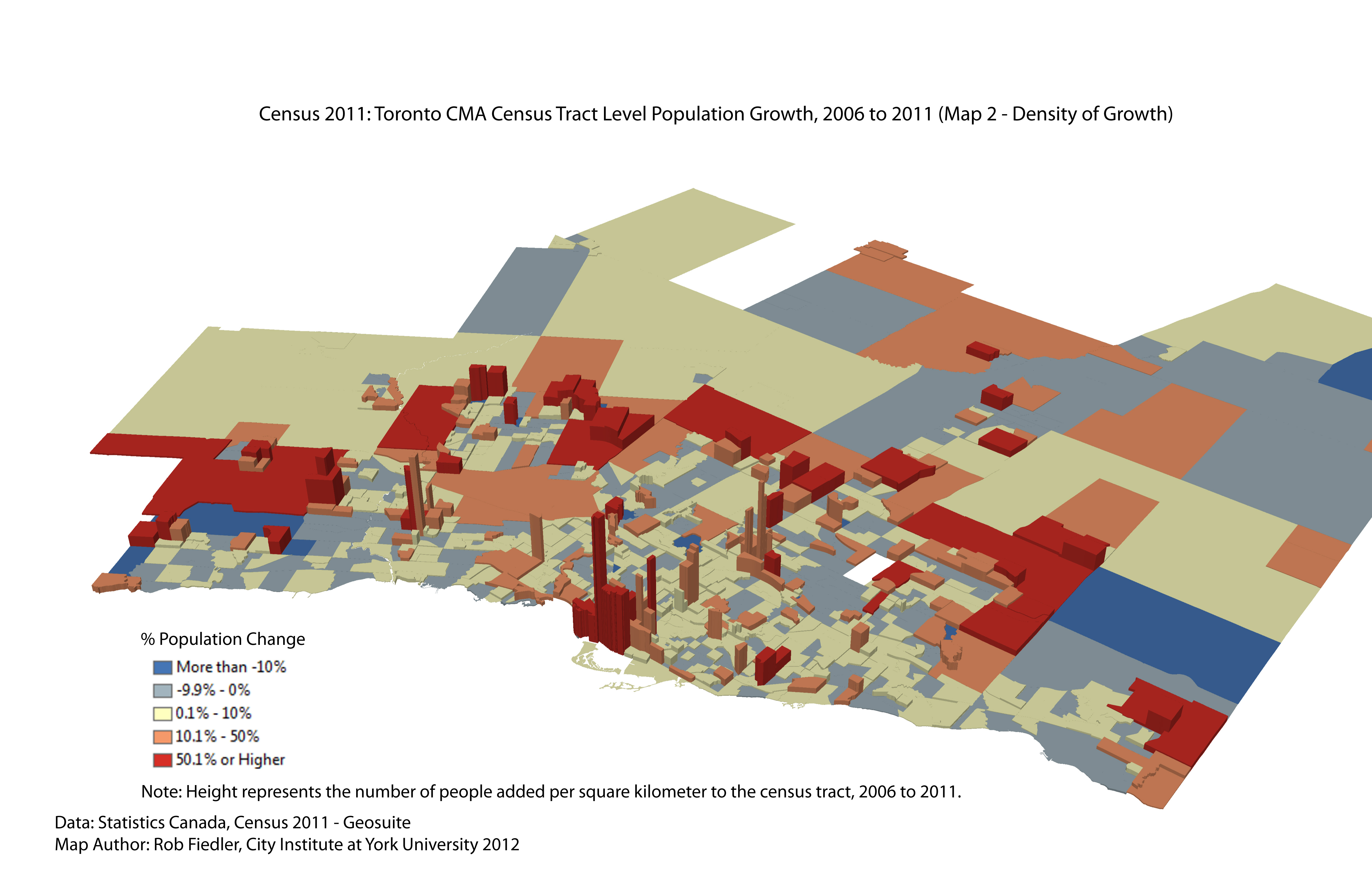
Map2 de-emphasizes the periphery by mapping height as growth normalized by density (people added per square kilometer). You can still see via the colour shade (classed the same as the previous map) where the percentage growth is higher, but this image emphasizes via height where the growth is higher density (the density of the growth in the peripheral CTs may be moderate or higher density where the growth is only occurring in a portion of the tract, which will like be split for the next census).
Fiedler believes the images shed light on the intra-urban growth patterns...the top-level numbers, as reported in the Toronto Star and Globe &Mail “tend to emphasize 905 growth, but there is an equally interesting story happening when you look at the unevenness of growth in Toronto ... little pockets of infill and redevelopment add lots of people in concentrated places, while more broadly the city is mixed between stable areas with little to modest growth and areas experiencing modest population decline (more like a slight thinning out). Mississauga is really starting to look the same way ... the older residential subdivisions are thinning out as children come of age and leave home (this is masked in the city-wide number because they are growing due to the final stages of greenfield development and intensification around Square One).”
Fiedler’s analysis also emphasizes “that growth is happening on the GTA's edge in Milton and Brampton in the west and to a lesser extent in York Region (growth is kind of moderate there relative to the last census)” Next to the condo-boom, the other impressive growth story, the urban middle question appears important ... “What to make of the spaces between the boom zones? … It is really showing up in the data now at the regional level ... not simply a 416/905 divide)”.
Another finding from the released census figures is that the old pre-amalgamation boundaries still matter:
The basic population counts for the pre-amalgamation areas within Toronto (using aggregations of CTs):
| Pre-1998 Muni | CTs | Population 2011 | Population 2006 | Absolute Growth | % Chg |
| East York | 24 | 115,365 | 112,054 | 3,311 | 2.95% |
| Etobicoke | 73 | 341,588 | 328,070 | 13,518 | 4.12% |
| North York | 131 | 651,083 | 624,610 | 26,473 | 4.24% |
| Scarborough | 123 | 625,926 | 607,876 | 18,050 | 2.97% |
| Toronto | 159 | 729,983 | 680,995 | 49,144 | 7.22% |
| York | 32 | 144,082 | 143,255 | 827 | 0.58% |
Fiedler concludes that in the 2006 census “Scarborough was the main (net) contributor to growth in the city, but this time around it is Toronto, North York and Etobicoke -- but especially downtown Toronto (there are five census tracts -- along the lake from Ontario Place to the approximately the Sugar Refinery that added collectively 22,272 people or 45.3 % of the total gain in the Old City of Toronto or 20% of the gain for the current City of Toronto”.
Rob Fiedler can be reached for more information and comment at Rob Fiedler <rsf.geogyu@gmail.com>
Comment on “The new demography of growth in Toronto -- 2011 Census”